We’re getting new glimpses of what to expect from the folks at Brookshire Grocery Company as they continue working on their first new concept food store. It’s called FRESH by Brookshire’s, and is scheduled to open early next year in the retailer’s hometown of Tyler, Texas.
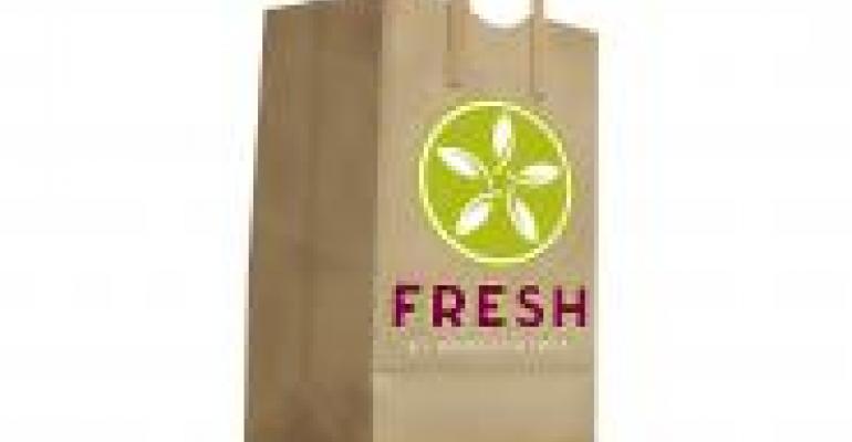
 The newest element to appear is the logo, which features the store’s name and a circular icon made of leaves that form a star-shape. It’ll be used on everything, from bags (shown) to uniforms, according to officials.
“FRESH by Brookshire’s is an entirely new concept — a food destination unlike anything else in the area — so the logo needed to reflect that,” said Rick Rayford, the chain’s president and CEO.
The logo was designed by Brookshire’s and the advertising firm of Richards/Carlberg. According to the latter, the “leaf-star icon represents the freshness of the herbs and produce that the new store will offer as well as the high-quality connotations associated with a star. In addition, the logo’s primary colors, plum and lime green, are appetizing and convey the appeal of fresh fruits and vegetables.”
Construction of the store, measuring 55,000-square feet, began in February. The finished supermarket will mark a departure for Brookshire’s in several areas. The store will feature more organic foods, bulk items, a bigger selection of health and wellness products, a pharmacy and a coffee/gelato bar.
In addition, there will be a major emphasis on fresh prepared foods, with separate bars offering everything from burritos to sandwiches, and soup and salad. Stay tuned.
(Photo credit: Brookshire Grocery Company)

