Sponsored By
Center Store
Woman in grocery store looking at center store items
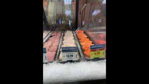
Center StoreCenter store experiences slow sales due to wallet-watching consumersCenter store experiences slow sales due to wallet-watching consumers
Unit sales have struggled in center store this year


Read more


Stay up-to-date on the latest food retail news and trends
Subscribe to free eNewsletters from Supermarket News