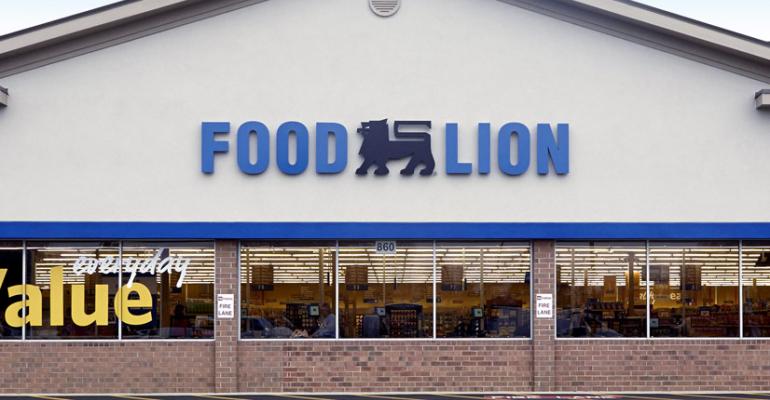
Food Lion is accompanying its newly launched “fresh, easy and affordable” strategy with a refreshed logo.
According to the company, the redesigned logo — which recasts the iconic lion in black and introduces a deeper shade of blue for the words — provides a “more modern look” for the brand. The logo was designed by Paris-based Minale Design Group, with input from Food Lion officials in Salisbury, N.C.
The tweak continues a long evolution for the brand, which was born as Food Town in 1957 and illustrated in this gallery of storefronts and logos through the years.
All photos and artwork courtesy of Food Lion
0 comments
Hide comments


