MOST ADMIRED 2004-08-02 (2)
SN asked designers and architects to name grocery store designs and retail concepts they admire. Following are some that were commonly mentioned:Bloom, a Food Lion Market, Charlotte, N.C.: Tabletop Circle, an area at the front of the store stocked with high-frequency items allowing shoppers to fulfill grab-and-go shopping trips, is just one notable feature of this new concept from Delhaize USA, Salisbury,
JON SPRINGER
SN asked designers and architects to name grocery store designs and retail concepts they admire. Following are some that were commonly mentioned:
Bloom, a Food Lion Market, Charlotte, N.C.: Tabletop Circle, an area at the front of the store stocked with high-frequency items allowing shoppers to fulfill grab-and-go shopping trips, is just one notable feature of this new concept from Delhaize USA, Salisbury, N.C. Inside, center store products are grouped together by how they're eaten, and shoppers can use handheld scanners to tally their grocery bill as they shop. The Food Lion association assures consumers that this convenience does not come with a high price. "In focus groups, people seemed to love the concept, but worried it would cost them," said Tom Henken, vice president of store design for Architecture Plus International, the Tampa, Fla.-based firm that designed the store.
Carrefour, Paris (locations worldwide): As U.S. food retailers like Kroger dive deeper into general merchandise and general merchants like Wal-Mart Stores and Target beef up their food operations, they would do well to look to the example of the 750-store hypermarket chain Carrefour, designers said. "The difficulty for supermarket operators is that they know they have to offer more than food, but when you walk into their store, you know what their core business is," said Joe Jackman, chairman and chief creative officer, Perennial, Toronto. "Carrefour is so on their game that when you walk in their store for the first time, you couldn't tell what side of the business they came from. They're a great general merchant, a great home store, and their food is wonderful."
Central Market, Austin, Texas (and other locations): Though this fresh-food concept was created by San Antonio-based H.E. Butt Grocery 10 years ago, designers still marvel at how it challenged conventional supermarket design ideas and made food shopping a thrilling experience. "They're playful, creative and inventive with their stores, and they have outstanding looks without looking expensive," said Tim Morrison, studio principal, Little Diversified Architectural Design, Charlotte. "It's extremely pleasurable to just meander around and experience. It changes the way you shop."
"Brilliant store. It challenged a lot of conventions," added Jackman. "But if we're still using it as a reference point, it says a lot about what isn't happening elsewhere."
Costco, Issaquah, Wash. (various locations): The warehouse club proves that great places aren't necessarily the result of the decor, but of the environment they create. "It's totally devoid of any decor or environmental treatments, but there's a great energy in the store created through the buzz of surprise and discovery that goes beyond their value statement," said Nick Giammarco, principal, Cubellis, Boston. "One day, they'll have car tires. The next day, a grand piano. The day after that, computers. They're able to connect emotionally to customers through a constant sense of surprise."
Fry's Marketplace, Phoenix: The new flagship for Cincinnati-based Kroger's hybrid grocery-and-general merchandise chain takes on Wal-Mart with a design that quietly emphasizes "aspirational views of how people want to live," said its designer, Kevin Kelley of Shook-Kelly, Los Angeles. Kelley said he had "a ridiculously low budget," and created a stripped-down, comfortable environment that could become Kroger's supercenter standard. "Every [grocery chain] I know has come in and looked at it," Kelley said.
Loblaw's the Real Canadian SuperStore, Toronto: This store, which opened this spring, merged the Toronto-based grocery store with the aggressively priced Real Canadian SuperStore general merchandise concept in an environment that communicates both a comfortable, enjoyable shopping experience and great values, said its designer, Jackman of Perennial. The 100,000-square-foot, two-level store won Retail Council of Canada's annual Retail Store Design & Layout Award.
Trader Joe's, South Pasadena, Calif. (various locations): The private chain, specializing in gourmet fare, draws the admiration of designers for a unique product offering and presentation. "I like concept over design. They've got some interesting little stores," said Henken.
"I'm as impressed with them as any company, and they're really flying under the radar in terms of their presentation," added Kelley.
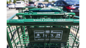
Whole Foods Market, Austin, Texas (various locations): The leading natural/organic chain draws raves for product presentation that conveys a passion about food and health.
"They've created some great environments -- not just from an architectural point of view, but in great product presentation, attention to detail [and] lighting," said Giammarco. "They've made the product the star and not the architecture."
"In terms of romancing the product, they've done a terrific job," added Henken.
Other retail concepts: "My best advice to grocery stores is to start looking at stores that aren't supermarkets," said Jackman. "If you don't sell cosmetics in your store, you probably haven't looked at Sephora, but they have a very interesting way of thinking about merchandising. The big idea can be taking an aspect from one category and moving it to another."
Supermarkets have begun the process, Henken noted. "One underlying trend that can affect design is the infusion of other retailers into upper management at food companies. It used to be everyone started as a bag boy. Now we're seeing more diverse backgrounds, and we're getting some new mentality. The Stop & Shop stores with Toys 'R' Us and Office Max departments is one example of that."
About the Author
You May Also Like


